

1980's inspired Bringus Studios Logo Redesign
A personal creative project I did using illustrator.
Here is the process:
I was first inspired by a graphic designer who is known for reimagining modern company's logos using common artistic trends in logo design from 1980.
Here are some of my favorites of his:


I now needed a logo to redesign. so i picked one of my favorite youtubers and inspirations, bringus studios.
here is his original logo:
.jpg)
Researching Logo Trends in 1980:
I needed my own perspective on what i thought the most successful companies in the 1980s logo's normally contained, so i did my own research.
here's what i found:
The at&t logo had a interesting change, the font was bolder, the icon was sharper, straighter, and had brighter colors. while the present day logo feels curvier and thinner.
Intel's logo used to be uneven, though straight and spacey and only features 1 color. the present day logo features 2 colors, and is oddly even.
the logo that most people think of when they hear "1980's logo" is back to the future, which i believe is the perfect example of 1980's graphic design.
its colorful, the metallic and gradient patterns were very common for logos. different fonts had different sizes, and fonts felt "progressive" and slanted.
Coming up with the final design:
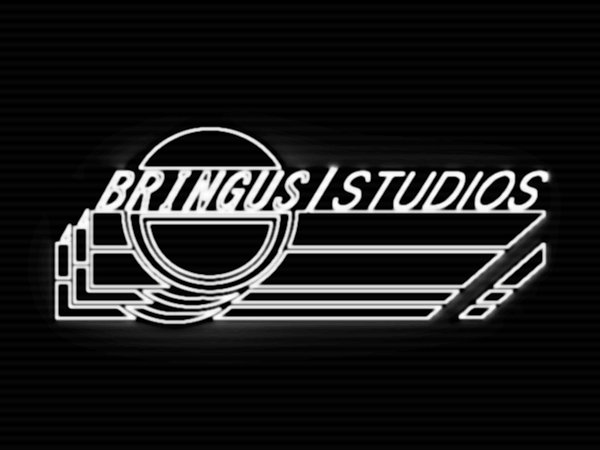
now that i had an idea of how i can reimagine the bringus studios logo to make it seem like it was straight out of the 80's, it was time to get to work.
i knew i wanted the final product to put a spin on the original smiley face icon by switching up the expression a little. i also wanted the censor bar to extend more toward another direction and carry the font with it. so this is what i got after a couple of redesigns:
.jpg)

new
old
I then put the product into photoshop to create a CRT-like effect,
Here Is the Final Result!: